News and other stuffs

Things to know, April challenge, news...

The challenge review and patterns

I’ve participated in many pattern challenges, and I even won one! But I’ve never found one that fully satisfies me. Of course, there are Spoonflower’s, and I really enjoyed participating in Shannon McNab’s for @sketchdesignrepeat. Anyway, these two inspired me and I highly recommend them. But I also wanted to do my own (probably French arrogance)😅! It was about creating “my ideal pattern challenge“ This also could give an idea of ​​how I work. Find the whole challenge in detail here on the blog! Several pages are dedicated to it, and it’s a wealth of information from which I still draw ideas myself! So before the review, here’s what it looked like : 4 X brief + moodboard (= My Pattern for each week) WEEK 1 – The red Dress My Floral Paisley is available in several colors here WEEK 2 – The French Pastry wallpaper My Rose Garden Tea Time is available in several colors here WEEK 3 – The Abstract Blue bedding My Ikebana Pattern is available in several colors here (among which indigo blue) WEEK 4 – The Childhood Perfume Box My Orange Blossom is available in three colors here 1. Each challenge page can still be read as an article about a pattern style, with stories,how to organize work and to create a pattern with moodboards,tips and links and lots of useful information even outside of the challenge. 2. It took a lot of preparation and layout work, and a lot of time. But I didn’t want to just throw out a bunch of 15 words (one word, one pattern, two days); I wanted to create a really stimulating challenge, like a real exercise, a real job. And it taught me a lot. 3. It wasn’t exactly a popular success😅! I’ve tried things, but not everything worked out as planned. But after this attempt, I know for a fact that I’m not comfortable with entertainment and hosting on social media. It’s definitely not me. 4. I remain very happy with the work accomplished and I think that the content created from these four April challenges remains a rich source of material to explore. 5. I never believed I could mobilize the troops or unite them behind me with this challenge. It may have seemed like a huge amount of work. It was a big task for me to organize, and it probably seemed overwhelming to anyone who wanted to participate in the first place. Facts: I chose the wrong month to organize my challenge. It was during the holidays, and long story short, the timing was really bad, but I hadn’t paid attention. I was busy with a thousand other things on top of my usual work, and this challenge was just one more thing on top of everything else! The icing on the cake was that this month was also the month of another challenge organized by someone very famous on Instagram, and I saw everyone who firstly seemed interested in mine swoop in 😅 That’s life! That said, I hadn’t prepared any designs in advance to get myself into the challenge, and I managed to create at least one design per week (in addition to everything else). So my challenge is achievable, yes! Plus, the few brave people who tried were, I think, satisfied with the adventure. (If they pass by here they can leave a message, complaints are accepted!) Conclusion: I don’t know if I’ll do it again next year… I’ll have to find an improved and simplified version, I have a year to think about it! …And in the end, I just created the challenge I wanted to create. > See all the patterns & posts on Instagram #aprilchallengebyandrea > See the collection on Spoonflower

The challenge review and patterns Read More »
Your Childhood perfume in a box

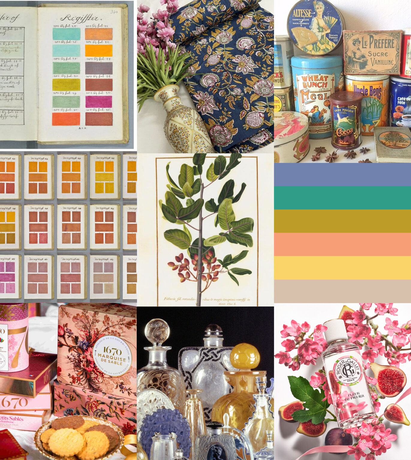
Week 4! Create a trendy pattern inspired by the following brief Pattern 4 – Your Childhood perfume in a box This time instead of client, we’re going to talk about storytelling!! Storytelling is the art of telling a story around a product to give it an emotional dimension and create a bridge between the creator, the product, and the consumer. In the context of perfume, it involves creating a narrative rooted in memory that connects the fragrance to memories, dreams, or aspirations. * About scents: We all remember the scent of our childhood, the one that transports us back in time. What’s yours? Your mother’s perfume and its precious bottle? The smell of your grandmother’s cakes that filled the house with their scent at teatime? The smell of the sea when you went on vacation with cousins? * What’s the point of creating beautiful packaging?About boxes: Our homes are full of decorated boxes that we’ve kept, cherished, and treasured. We sometimes fill them with homemade cookies for special occasions like Christmas, or with little things to create a little personal museum. They’ve been part of our family since childhood and fuel our imagination. (I sometimes prefer the box to what was in it.) * Combine these scents and create an illustration directly linked to your personal story to create a dream box for your childhood fragrance. Of course, the palette and mood board chosen will be entirely personal this time. The palette and moodboard I provide here are personal combinations I created for #AprilChallengeByAndrea (Week 4 – Your Childhood perfume in a box), the pattern challenge I promoted on Instagram. The color palette and hex color codes are inspired and match the moodboard (Photo credits below). Create a design evoking the scents of your childhood that will be used on the packaging of your choice: perfume label or box of biscuits/chocolates. My suggestion: This time, you’re your own client! Do what you truly love. * Choose a flower, a fruit, a landscape…and create your own “bouquet”. * you can draw an illustration, not necessarily an all-over pattern. * Depending on what scent you choose, what will you draw? A vintage image for a box of chocolates? A gouache illustration for a perfumer’s new fragrance? A children’s book-style drawing for a box of Christmas cookies? * However, you should not make an indigestible mixture: respect the seasons (choose a fruit and a flower that grow in the same season for example.) *** * Make a list of your favorite brands or design houses for which you would dream of creating illustrations or patterns… * As you may have noticed, this theme inspires a certain nostalgia. To delve even deeper into retro, explore the work of Nathalie Lété. Her world is full of charming scenes between vintage flowers and old toys: a feast for the eyes! IG to follow her: @nathalie_lete (Link) * Heritage style is a real underlying trend, there will always be room for nostalgia, it’s a safe haven! * Pinterest search : flower perfume packaging design (Link) * Cookbooks are also a wealth of inspiration in their layout and photographs. I personnaly really like the world (and the recipes!) of Marie Laforet, her blog: 100-vegetal.com (Link). * Get inspired by looking at photos from food stylists and photographers… see below. Photos from Clémence Durollet, Pablo Merchan-Montes, Anthony Florio. *** *Credits: Beautiful Fragonard orange tree, antique palette, vintage metal boxes, shortbread marquise, vintage popcorn box, view of Porquerolles, l’Artisan Parfumeur, Niçoise salad, Roger&gallet soaps, Gucci Flora box, Crabtree & Evelyn London biscuits, pear yogurt cake: recettemoderne.com, shortbread from La Mère Poulard, Nathalie Lété tableware for Monoprix, Kashmir tour: Tricon Holidays, English tea and scones: unecuillereenbois.fr, Rose eau de toilette Panier Des Sens en Provence. Lithographed tin cookie tins, Zelda & Charlie. Pattern 4 – Your Childhood perfume in a box – How to join (on Instagram): Last week!

Your Childhood perfume in a box Read More »

Abstract blue bedding

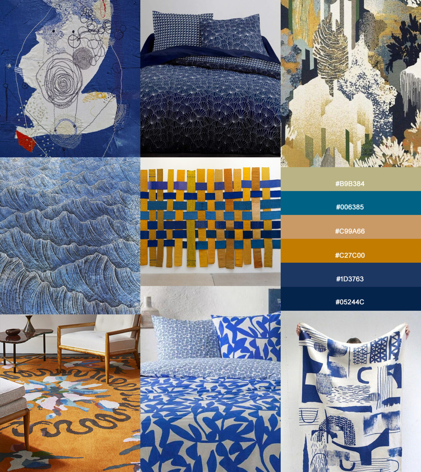
Week 3! Create a trendy pattern inspired by the following brief Pattern 3 – Abstract blue bedding You work for a high-end hotel chain*. Their bed linens are plain, like most hotels, but in a dark navy blue. The style is elegant, clean and rather masculine. The exact shade is as shown in the attached palette (#05244C). They need new matching curtains and bedspreads in cobalt/indigo tones to complement the decor. The pattern they need will be printed on linen, a noble and natural material, which adapts to ethnic, authentic and sober atmospheres. *Any resemblance to persons living or having lived is purely coincidental and unintentional. The palette and moodboard I provide here are personal combinations I created for #AprilChallengeByAndrea (Week 3 – Abstract blue bedding), the pattern challenge I promoted on Instagram. The color palette and hex color codes are inspired and match the moodboard (Photo credits below). Create a abstract pattern with a Japanese vibe that will stand the test of time, which will work equally well on a bedding set or curtains. My suggestion: Be inspired by the use of blue indigo dye on Japanese textiles, boro, sashiko, shibori… * Explore and take inspiration from contemporary art as much as from ancient and traditional history (boro, sashiko, shibori…>see below). Explore abstraction and geometry! Explore collage, draw, cut, glue… * You can stay rather realistic or use organic shapes. If you take Hokusai’s print of Mount Fuji as an example, you see that the shapes are extremely simplified, close to a very contemporary abstraction. * Use contrasts ranging from orange to beige. * Pay attention to your client’s values: timeless elegance, a touch of masculinity, discreet luxury, for travelers from all over the world… *** 青い Blue and Japanese textiles * Boro and sashiko. What is Boro ? In Japanese, Boro means rag. The poor population of northern Japan collected used textiles, patched them together, creating a patchwork (modest art). Sashiko is an embroidery technique used to assemble and decorate patchwork pieces, traditionally small white embroidery stitches on an indigo blue background. The motifs depicted had an aesthetic and symbolic function. Once reserved for the aristocracy, indigo-dyed fabrics have become more democratic and, thanks to boro, have become symbols of “modest art.” * Shibori is an ancient dyeing process originating in Japan. It roughly corresponds to what we might call “tie-dye” (and there are several techniques to create varied patterns and subtle nuances). *** Indigo is one of the oldest textile dyes. Indigo dyeing has been used in many civilizations. It comes from the indigo plant, a plant native to India. The chemical industry supplanted natural indigo in the late 19th century. But indigo remains one of the rare natural dyes still used today. This produces a navy blue called Japanese blue, slightly different from the indigo shade itself, which tends towards purple. Indigo dyeing (with fermentation) imparted repellent and antiseptic properties to fabrics (useful for samurai costumes, for example). It’s the color of work clothes, jeans… *** * It’s even better if the pattern has no up and down and can be enjoyed from all directions! * Consider creating a second simple repeating pattern, which can be used as a lining or on the back of cushions, for example. * See more images with Pinterest search: Boro (Link1), Sashiko (Link2), blue japanese textiles patterns (Link3) * Article (Link) about Japanese boro textiles [tell histories of labor and love through patchwork]. * Another interesting article on boro on Japanobjects.com (Link) *Follow @srithreads on Instagram for more boro textiles pictures and indigo dyed fabrics. In 2020, PANTONE named Classic Blue (LINK) its Color of the Year. “A calm and confident shade of blue, elegant in its simplicity. Gender-neutral in its universality and seasonal in its timelessness, this firmly anchored hue allows for color combinations across the spectrum, yet stands alone. Representing its heritage yet resolutely contemporary, the versatile PANTONE 19-4052 Classic Blue takes on different appearances when applied to various materials, finishes, and textures, from shimmering metallics and high-tech materials to artisanal blends and the most delicate fabrics.” Here is a definition that corresponds to what we are going to create! Boro Textiles: Sustainable Aesthetics by Japan Society NYC *Credits: Junko Oki, Japanese textile artist; Merlin Fabric Lelièvre Paris; LEE HYUN JOUNG, Silence 2022; rug Chistian Berard; Blanket Laura Slater; Kokka fabric, Bedding sets: Pierre Frey, Today, Kiabi, Christian Lacroix; Sheila Hicks, Interchangeable warp and weft; Lê Phô, Tonkin Landscape – Hanoi, between 1932 and 1934 (Vietnamese artist) Cernuschi Museum (Link); Lee, Ung-no, Composition (구성) 1974 (Korean artist) Cernuschi Museum (Link) ; Kirifuri Falls on Mount Kurokami, Blue Fuji, Beach of Shichirigahama by Hokusai; Kimono, Tohoku district of Japan,19th century, Nishikie Yoshitora Edo-era 18C Japan; Ceremonial kimono for young boys “iwaaigi” Guimet Museum (Link); Patchwork Elizabeth Michellod-Dutheil. Pattern 3 – Abstract blue bedding – How to join (on Instagram): See you next week!

Abstract blue bedding Read More »

French pastry wallpaper

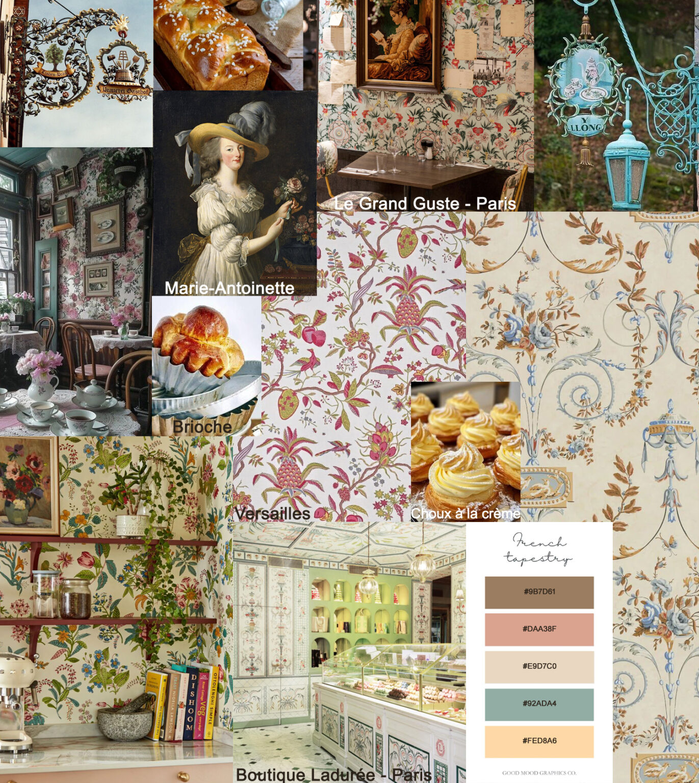
Week 2! Create a trendy pattern inspired by the following brief Pattern 2 – Tea Room Wallpaper A group of friends in their thirties wanted to create a warm and welcoming space to revitalize their street and connect local residents. They took over a former commercial space and transformed it into a neighborhood canteen. The cuisine is simple yet refined, showcasing organic and local produce. In terms of decor, they favor vintage vibes: the bottom of the walls is tiled in white, the furniture was second-hand and repainted in pastel shades, matching the palette below! Near the counter, a corner that could accommodate a few bistro tables will become a tea room space where homemade pastries will be served outside of mealtimes. People will come here to share a brunch or simply enjoy a selection of teas and dip madeleines into mismatched cups. All that’s missing is a few strips of wallpaper to delineate the tea room space and add a touch of whimsy. French-style wallpaper, why not? *Any resemblance to persons living or having lived is purely coincidental and unintentional. The palette and moodboard I provide here are personal combinations I created for #AprilChallengeByAndrea (Week 2 – Pastry wallpaper), the pattern challenge I promoted on Instagram. The color palette and hex color codes are from GoodMoods Graphics Co (Photo credits below) *** A little History: A style is defined by a set of elements drawn from a particular context at a given time. It is difficult to define the so-called “French” style in its classical sense, given its diverse influences: English, Chinese, ancient Greek, and the nascent Egyptomania. Let’s focus on the Marie-Antoinette style, which I would call “Château style“! At Versailles, the walls and furniture of the Queen’s boudoir and dining room were restored by Maison Pierre Frey, with a richly illustrated canvas in pastel shades of pink and green depicting an interlacing of flowering branches, birds of paradise, and pineapples. The pineapple, nicknamed the king of fruits for its crown of leaves reminiscent of royal crowns, was also the fruit of kings. Now it’s time to create! Imagine a whimsical French-style wallpaper with interlacing patterns and pastel shades, but instead of pineapples, draw cakes or pastries! * Favor pastels! Create wallpaper that matches the furniture! (use the provided palette as a guide) * As the lower part of the walls is made of white tiles, you can consider a white background for your wallpaper. * Incorporate elements into your design like ingredients in a recipe, it’s not only the style that matters but the balance of the whole, the flavor, not in the mouth, but for the eyes! Here, don’t be afraid of being too sweet! * Your pattern design here can be complex.…But complex does not mean overloaded. * Pay attention to your clien’s values (the canteen/tea room): ​​solidarity and gourmandism, and the assumed age of their customers (a mixed population of local people), … So don’t reproduce the Queen’s boudoir, keep it playful! * Appeal to your sweet tooth, we need a pattern here that whets the appetite! * When creating a wallpaper pattern, the scale can be quite large. Here, the corner is a relatively small space, which allows customers to observe the patterns up close, you can offer a finely detailed pattern. * Your pattern will also be suitable for bedding, curtains and upholstery. * You can extract one or more elements to create a collection (blenders…) * Have a look at Pinterest Predicts 2025 (link) and be Rococo! * The trend book of GoodMoods “la delicatesse” (link) = palette: powdery; decor: lace; mood: innocent + Marie-Antoinette MoodBoard (Link) ! * Break time! Eat a ‘brioche’ and visit the Château De Versailles (link) Did you know that Marie-Antoinette never said “Let them eat cake” about the French people who were short of bread? But rumors die hard, some even become legendary! In French we say ‘brioche‘ (“Eh bien qu’ils mangent de la brioche!”) and the word is so sweet! and rich, like the pastry it designates, but it’s not a cake strictly speaking. *Credits: Rustic cake shop, vintage style bakery and other photos are from Pinterest research…Restaurant Sir Winston (LAURA Gonzales, Paris), “Le Grand Guste”, Marseille, “Big Mama”, Lyon, boutique Ladurée (Paris) Pattern 2 – Tea Room Wallpaper – How to join (on Instagram): Hope to see you next week!

French pastry wallpaper Read More »

A Red Dress

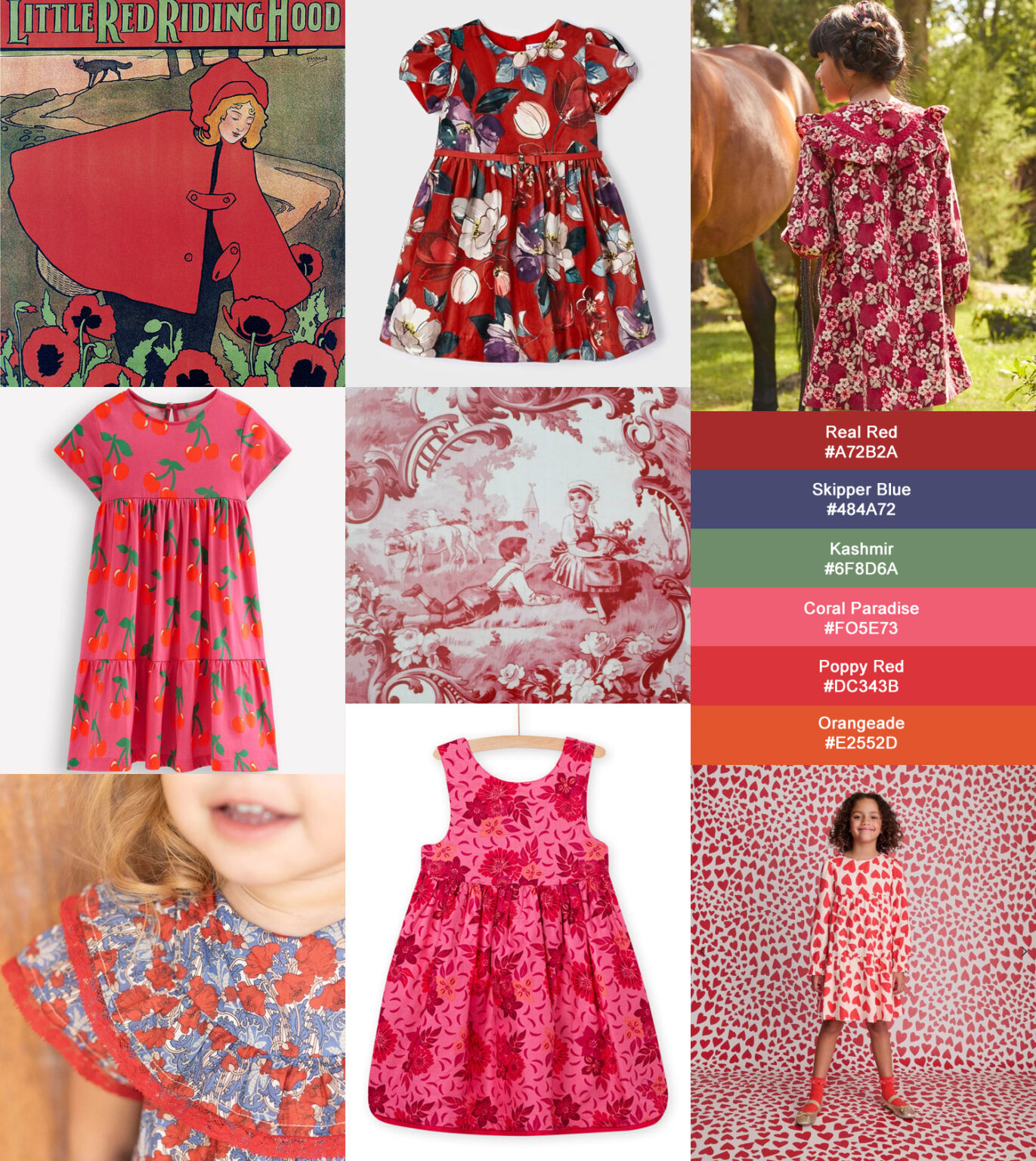
Week 1! Create a trendy pattern inspired by the following brief Pattern 1 – The Red Dress The palette and moodboard I provide here are personal combinations I created for #AprilChallengeByAndrea (Week 1 – The Red Dress), the pattern challenge I promoted on Instagram. The hex color codes are combined to create harmony with real pantone colors found among the current trends, 2025-26 trends (Photo credits below) The story: “Sonia and Mirabelle* are two dynamic young women who co-founded a sustainable and dynamic online children’s clothing brand. Passionate about ethical fashion and new mothers themselves, they prioritize the use of organic materials, ensuring products that are respectful of the planet and the sensitive skin of little ones. But they want to break the stereotypes of eco-friendly fashion by creating colorful and playful pieces, imbued with joy and creativity. Their goal is simple: say goodbye to sad beige and neutral! They want also to offer girls an alternative to Barbie pink! to prove that ethical and organic clothing can also be fun, trendy, and full of life!” *Any resemblance to persons living or having lived is purely coincidental and unintentional. Draw a pretty pattern for a little girl’s dress with red as the eye-catching element in your design. * What is your favorite red? What shade of red? What does this red remind you of from your childhood? Is it Little Red Riding Hood’s red? Is it a crushed raspberry red like your favorite jam? Is it the memory of your first scratch? A tendency toward pink or orange? Which one do you choose from the palette: Real Red? Coral Paradise? Poppy Red? Orangeade? (I picked these shades from Pantone current trends and forecasts for 2025/2026). * Once you’ve found your own shade of red, choose the season that matches it. This can help to find the main motif (summer fruit? autumn mushroom? …) * Draw a pattern while trying to visualize the dress being worn. What will you draw: A pattern for a sleeveless jersey dress? A pattern for a wintery design worthy of a Christmas story? This can help you find the right style or scale for your pattern. * Your pattern design doesn’t need to be complex. It could based on a classic plaid, subtle ethnic stripes, or a simple illustration of your favorite berry… * Pay attention to your client’s values ​​(here an ethical brand) and the assumed age of their customers (=the mothers!) * Summon your inner child! Have you ever dreamed of wearing a beautiful red dress? * To create and adapt a children’s clothing, you have to ask yourself a certain number of questions: what use? outdoor, casual, comfortable, specific use, etc. What constraints? manufacturing? What materials? smooth or plush… * How to make durable clothing patterns? They must be easy to match! Why no a trendy pattern that is suitable for several seasons? (A summer dress still looks pretty with a cardigan over it!) * A limited palette limits production costs and facilitates combination with other garments. * Your pattern could be used also for: fabric, pouches, gift wrap,… * Resources! A wealth of information “How to Create a Children’s Collection” on the Textile Addict website! And much more…essential (French) site! Just ask Google to translate it for you 😉 Dark cherry red is trendy! * (Link) Take inspiration with the: Bright Red Moon (Lunar Eclipses) Color Scheme. * (Link) Trendy red of the moment, check the moodboard from GoodMoods. * Miranda’s advice: go check out the patterns and colors of children’s clothing in your supermarket! They’re definitely the latest trends. And rewatch The Devil Wears Prada (…or not!) Literature is inexhaustible on the subject of red; for my part, I always read with pleasure the writings of the French historian Michel Pastoureau, “Rouge, histoire d’une couleur” Seuil, 2016. *Credits: Little Red riding hood, John Hassal, Upholstery toile for kids 1888, “Little Red Riding Hood” (Ill. Ilya Green) published by Père Castor, “Little Red Riding Hood, The Wolf Accosting Her In The Forest” (Walter Crane), brand dresses : Sergent Major, Tartine et Chocolat, DPAM, Boden,… Antique dress with cherries 1940, “Portrait of a Girl” 1625, Paulus Moreelse, Peau d’Ane by Jacques Demi (1970), Queen Margot (Patrice Chereau 1994) Pattern 1 – The Red Dress – How to join (on Instagram): See you next week!

A Red Dress Read More »

Tips and links to take on the challenge

I’m launching my first pattern challenge on Instagram!! This is how I will organize it…and some other thoughts Why this challenge? Because I’ve never done it before! And I’d love to! So I’m going to try to make this challenge as enjoyable as useful. Ready to get to work? So, here we go! #challenge You will have to create a new pattern by freely following the instructions, as a creative game. It’s up to you to make it your own! How? *** I’ve organized 4 briefs for the creation of 4 patterns (1 per week) that you’ll find during the 4 weeks of April. Each brief is made up of 4 parts: > 4 topics during the 4 weeks of April: Be there to participate or to cheer! *** My goal each week: I’m going to focus on the use of the pattern. Too much importance is often given to the pattern quality, without taking into account the use for which it is intended. This is why I think that many very beautiful patterns artistically speaking do not find buyers. > As a pattern is primarily intended to be applied and sold for a very specific use, it involves three key stakeholders: #challenge During these four weeks of challenge, I will imagine personas, imaginary customers and their needs (business context) in order to target objectives. Your client wants to know you and how you work! I’ve been asked several times to show my work in progress, and… I had nothing to show! It’s rather a shame. It’s important for clients and collaborators: they want to see how you work! We don’t all have the same universes, the same techniques, or the same way to use tools. So that’s what will set us apart! You have to show it, not only for socials and followers, but also to reassure your client/interlocutor who doesn’t know you! To be honest, I don’t do it yet, I really need to get on with it! It’s not about impressing the competition or revealing trade secrets, but it can also help you gain perspective on your own work and strengthen its long-term consistency. So make photos, videos, timelapses etc, show your studio etc… Many tools exists, find yours, choose the one that suits you! I sometimes use Canva. Easy and clean. #challenge During these four weeks of challenge I encourage you (and me too) to share your processes #wip! *** Know your customer as well Who is your client? A one-time buyer who found your design on a POD platform and loves your colorful world? A small business with specific needs that prints in small batches and wants to license a collection? A large company that needs simple, quick-to-make (and therefore inexpensive!) patterns for items that will only last one season? Knowing your client will allow you to set clear guidelines and present the appropriate work (Fast, simple and few layers or complex, personal and available in several files). #challenge By the end of these four weeks, I hope we’ll all have four additional patterns ready to be licensed or become successful in our catalog! *** ✨Makers and small businesses!✨ “I look forward to your participation and support!”Need a new pattern for your summer collection or your children’s outfits? Have you been looking for a pattern for a long time and still haven’t found what you’re looking for?📩 Leave your comments or requests/ideas in a message and don’t hesitate to contact the designers of your choice (we’re always happy to hear from you). Know & assert yourself What makes you unique? whether it’s style, personality, history, the way you stage or present your work, technique, etc. In these uncertain times, faced with competition and the rampant use of AI, it’s the artist personality that make the difference and must prevail. A pattern is often successful not because of its perfection, but because of the emotion it arouses. That impression we have when faced with the work of a craftsman or an artist, and which we do not find when it is designed by a machine or a mechanical act. My added value… What do I hope for from this challenge? That everyone will embrace the stories, colors, and ideas I’m going to share with you. That everyone will be able to go further and explore new avenues. That everyone will be able to create their own unique design, the fruit of their personality, their journey, their story… without competition, and that you will assert yourself as an artist. #challenge For this challenge I will ask you each time to call upon your tastes, your memories, …everything that can make your pattern at the end yours and not just anyone’s. Make a moodboard For every project, the first step is to create a moodboard. This board will be composed of the client’s expectations (and needs), as well as your own inspiration. It’s the meeting of two different aspirations that will need to converge to result in a pattern design that will ideally suit you as much as your client! Make a palette Taking someone else’s palettes isn’t very interesting. During this challenge, I’m only going to give you palettes as a guide, on the condition that you take them and arrange them and adapt them to your moods, style, etc. I don’t use palette generators. I just look around. Funny tip: You can take an inspiring photo (your last vacation!) and open it in a drawing software, use the pixelation>mosaic filter to obtain color tiles from which you can pick a few shades. There are endless ways and tools to create a color palette, here are a few links: #challenge This is why I propose for this challenge to provide for each week a moodboard which will serve as a guideline, you are free to follow it, to be inspired by it or to recreate a new one. Keep at least one dominant color from the palette. The patterns will be grouped into a collection on

Tips and links to take on the challenge Read More »

error: Content is protected !!
Scroll to Top